Ivonne Ramirez
Case Study

McDonald's Mobile App Home Screen Redesign

McDonald's Mobile App Home Screen Redesign
Overview
Role
UX Designer
Company
Publicis Sapient × McDonald's
Timeline
3 weeks
Team
Creative Director, UX Designer (me), 2 Visual Designers, Project Manager
Tools
FigmaMiroUser Testing (Wevo)
Platforms
iOSAndroid
The Challenge

McDonald's needed to reimagine its app home screen to prioritize ordering, reduce cognitive load, and create clearer visual hierarchies. The existing experience was cluttered with competing content and unclear navigation patterns.

Problem statement: Reimagine the home screen to prioritize ordering with reduced content, clearer hierarchies, and increased visual consistency.
Process & Methodology
1
Preliminary Research
Analyzed click patterns, user feedback, and competitive benchmarking. Identified that 68.2% of clicks were on bottom navigation and 20.3% on deals.
2
Stakeholder Workshop
Facilitated 'Dream Home Screen' exercise with internal team and McDonald's stakeholders to surface alignment on priorities and requirements.
3
Problem Definition
Co-created a shared problem statement focused on prioritizing orders, reducing content clutter, and improving visual hierarchy.
4
Design Exploration
Developed four distinct conceptual directions representing different strategic priorities: marketing, loyalty, recents, and simplification.
5
Validation & Refinement
Prepared designs for customer testing to validate which direction best balanced crave-ability, ordering efficiency, and personalization.
Research Insights

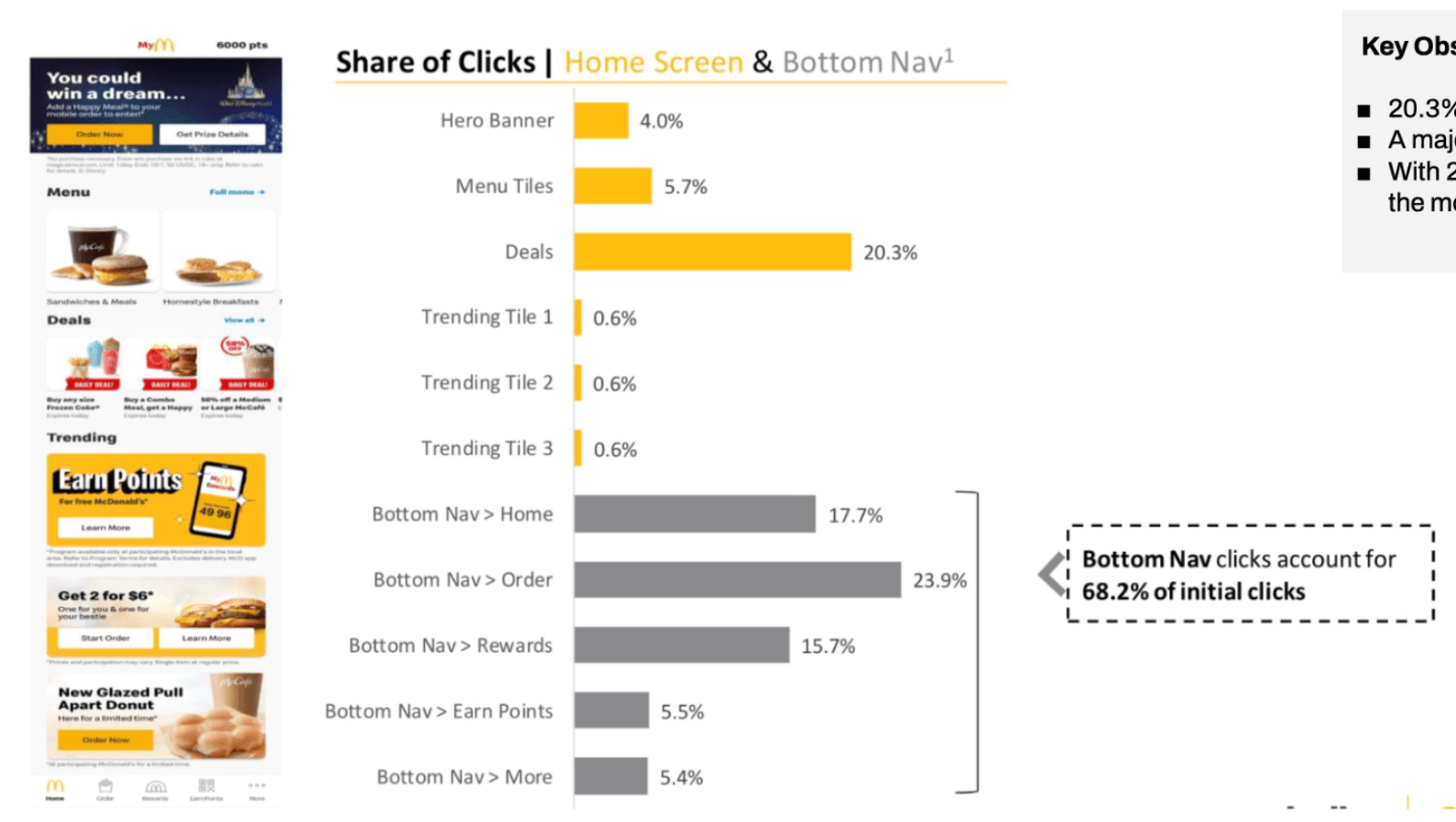
In an informal interview conducted by a user testing company, Wevo, value and convenience are mentioned most, with earning points and redeeming deals emerging as reasons to use the app. I saw 45% of users mentioned "deals" as the relevant content shown. The "start order" button, prominently featured at the top of the page, provides a clear call to action.

The top reason for using the app:

  • Deals/ Discounts

  • Points

  • Ordering food ahead of time for quick, easy pick-up and checking the menu.

0.0%
Bottom nav clicks
0.0%
Click on Order navigation
0.0%
Clicks on Deals carousel
Share of clicks analysis revealed users gravitated toward deals and bottom navigation controls.
Key Research Findings
Customers skip straight to deals and order CTA
Value and convenience are top motivators
Competitors prominently show recent orders
'FREE food' messaging drives engagement
Reordering past items is a must-have feature
Favorites need better accessibility
Screenshot 2024-02-07 at 12.17.16 PM.png

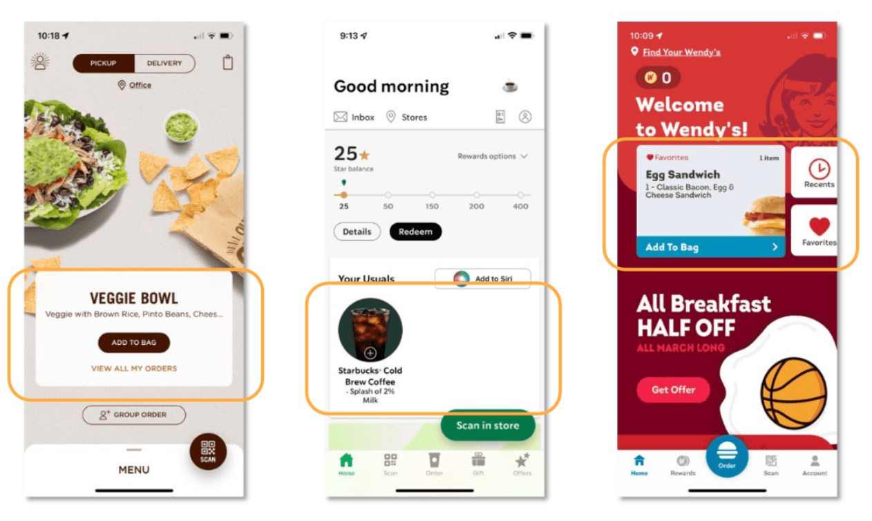
I reviewed the app experience of our competitors, Chipotle, Starbucks, and Wendy's. A consistent pattern I found was displaying the customer's recent order on the home screen. From the Wevo survey, we found that recent orders on the home screen were an important feature to be found.

There should be a way to easily reorder past items. Especially customized items.

User 3
Research Participant, 2022
Strategic Workshop

We hosted an in-person workshop with our internal UX team and McDonald's stakeholders. Starting with "Draw your dream home screen," we surfaced common expectations and aligned on a shared problem statement.

Screenshot 2026-03-25 at 12.01.43 AM.png
"Draw your dream home screen" activity sketches from stakeholders
Create Crave-ability
High-quality food imagery performs exceptionally well. Make the food the hero of the experience.
Driving Orders
Get customers off the home screen and into ordering as efficiently as possible. This is priority #1.
Know Our Customers
Demonstrate recognition through personalization beyond greetings. Give them tools to order faster.
Balance Marketing
Honor 'Only in the App' campaigns while maintaining utility. Don't sacrifice usability for promotion.
Design Exploration

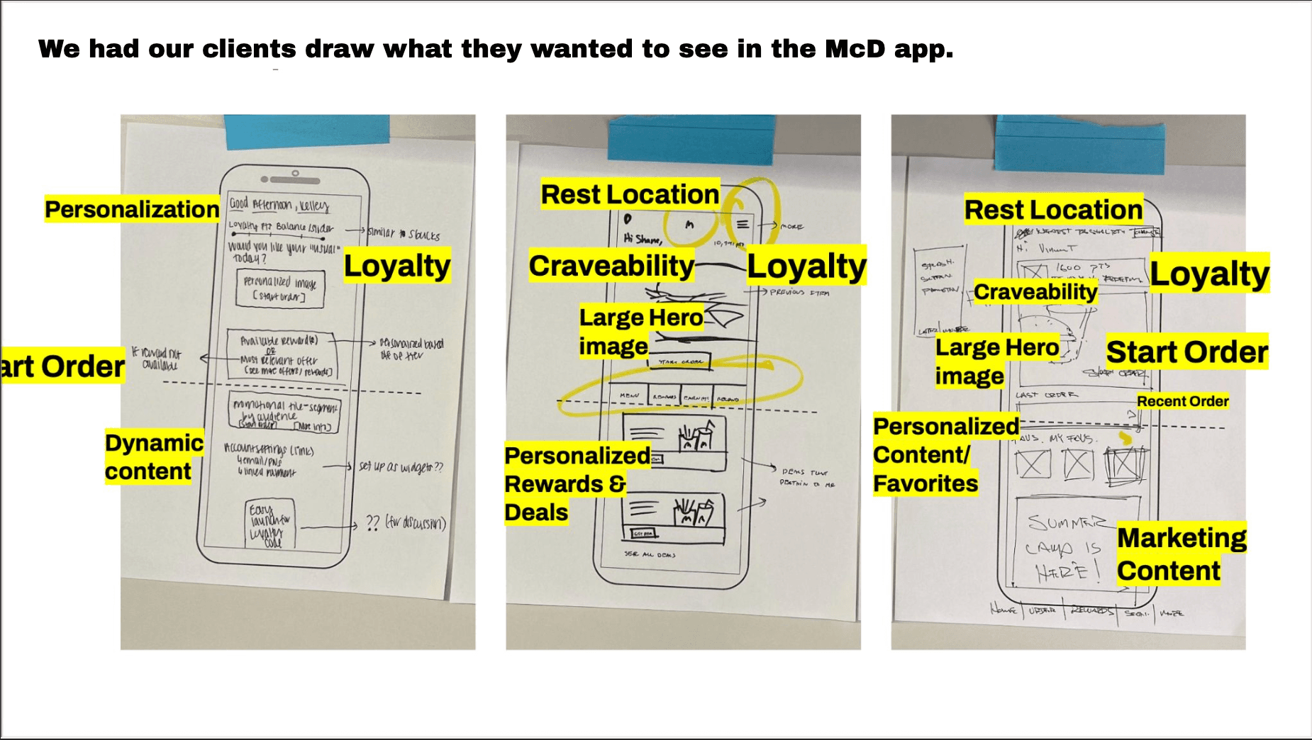
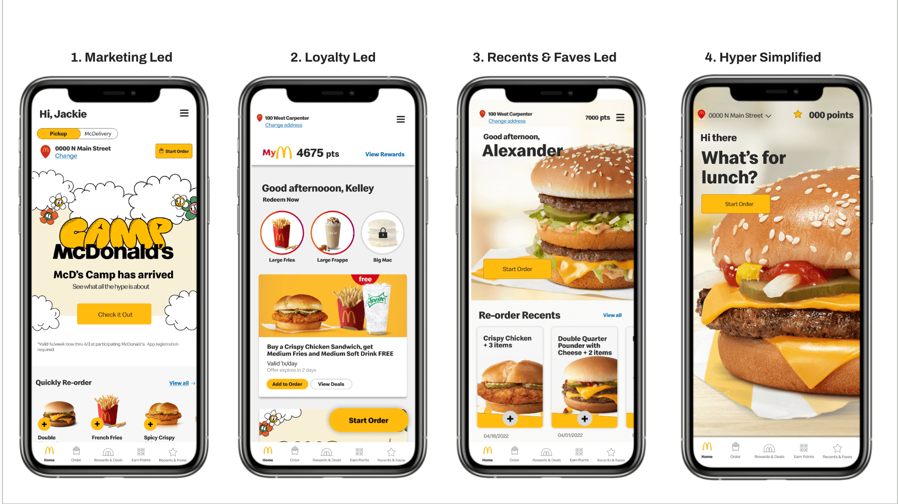
My team explored four distinctly different conceptual directions to validate with real customers. I led the design exploration for two of these: recent & faves led, and hyper-simplified.
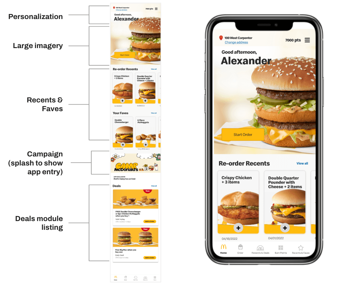
Four design directions: Marketing Led, Loyalty Led, Recents & Faves Led, and Hyper Simplified.

Recent & Faves Led

This direction prioritized convenience by making recent orders and favorite items the focal point. Research showed customers love the ability to quickly re-order their go-to items, and competitors were successfully using this pattern.
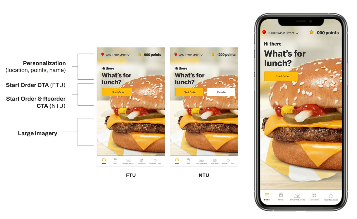
Key Design Moves
Personalization with the customer's name at the top, large hero imagery to avoid overwhelm at app launch, a prominent recent orders section, easy reorder access, and balanced deal visibility.

Screenshot 2024-02-07 at 12.59.08 PM.png
Design component breakdown showing personalization layers, hero imagery, recents, campaigns, and deals modules.

Hyper Simplified

Inspired by Chick-fil-A's single-hero-product approach, this concept maximized crave-ability through minimal cognitive load. The large food image dominates, with dual CTA options based on customer behavior: Start Order (for new orders) or Reorder (for returning customers).

Hyper Simplified concept showing FTU (First Time User) and NTU (New Time User) variations with large imagery and contextual CTAs.
Key Takeaways
What We Learned
23.9% of users go straight to the Order button on bottom nav. Most users don't spend time exploring. Food imagery drives emotional response.
How We Applied It
Positioned prominent CTAs above the fold. Maximized hero food imagery. Removed non-essential content. Made recents and personalization central to the experience.
Impact & Next Steps

While a full test & learn wasn't executed due to internal team changes, this work provided McDonald's with validated design directions grounded in real customer data. The redesign was set to be revisited with new stakeholders, establishing a strong foundation for future iterations.

This ask allowed me to get closer to our McDonald's stakeholders, present findings based on real data, and have real-time discussions on what matters for customers.

My designer Reflection
2022

Next Project

Travel Mode: Change the Unchangeable

View project